

Mencap
Editorial & Report Design
Focus: Print and digital publications for internal and external audiences
Client: Freelance
I regularly work with Mencap to design print and digital communications, including reports, posters, and supporting assets, that clearly articulate community impact and partnership outcomes. My work focuses on transforming detailed, information-heavy content into accessible, structured, and engaging formats suitable for a wide variety of audiences.
Two key projects include a six-month impact report created in collaboration with Omaze, and a publication produced alongside the Care and Support Alliance (CSA). Across both projects, my focus was to ensure key information was communicated with clarity, sensitivity, and visual consistency - supporting Mencap’s brand identity, values and mission.
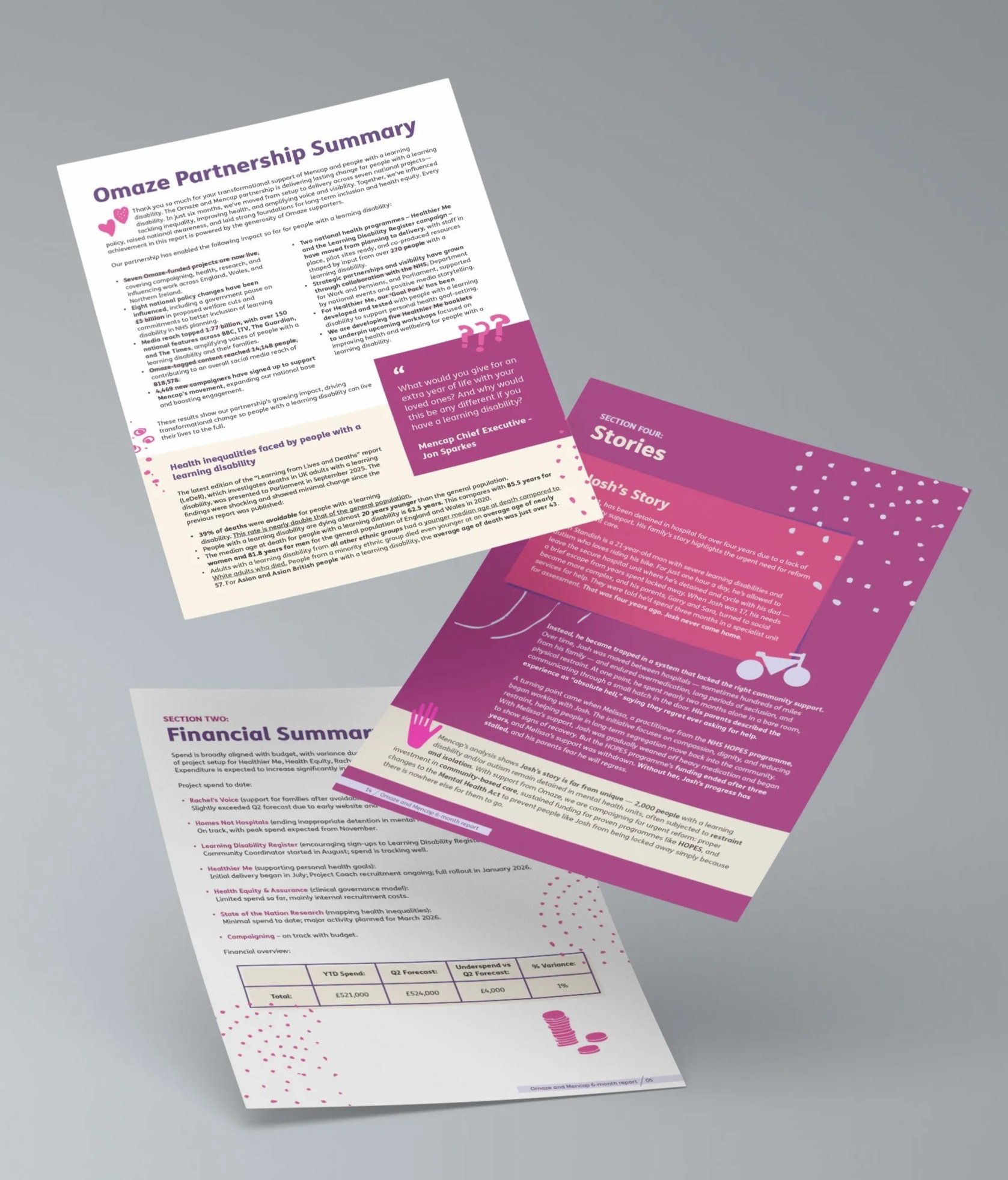
Mencap x Omaze - Six Month Impact Report (right)
This project involved designing a six-month impact report documenting the outcomes of Mencap’s collaboration with Omaze. The report was created for both digital and print use, and shared internally and externally across stakeholder networks.
The brief required a visually engaging yet clear layout that balanced storytelling with data and outcomes. Working within both Mencap and Omaze brand guidelines, I designed a structured editorial layout that highlighted key achievements, statistics, and narratives, while remaining accessible and easy to navigate.
The final report combined strong visual hierarchy, considered typography, and branded graphic elements to ensure the content felt engaging, professional, and appropriate for a broad audience.
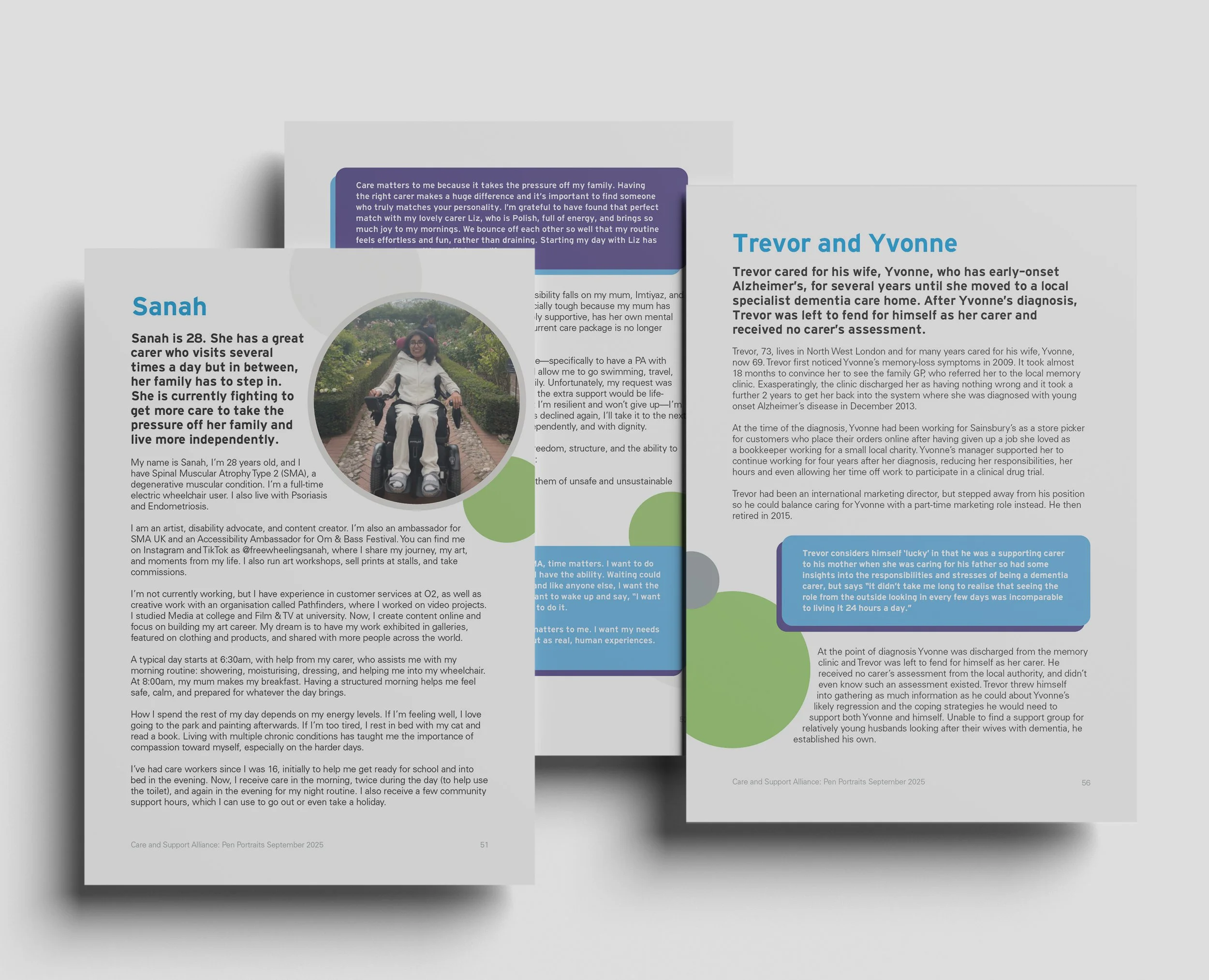
Mencap x Care & Support Alliance - Collaborative Publication (left)
In collaboration with the Care and Support Alliance, I designed a publication and interactive PDF based on a 50-page document containing stories and insights from CSA members.
The brief involved transforming a 50-page, text-heavy document — containing personal stories from CSA members — into a clear, accessible booklet and interactive PDF suitable for sharing across member networks and the wider public.
My role was to structure the content, establish a clear visual hierarchy, and ensure the finaldesign felt engaging while remaining respectful and easy to navigate. The finished booklet balanced strong storytelling with clarity, making complex information more approachable for a broad audience.